Lignator
Web Design / Development / Maintenance
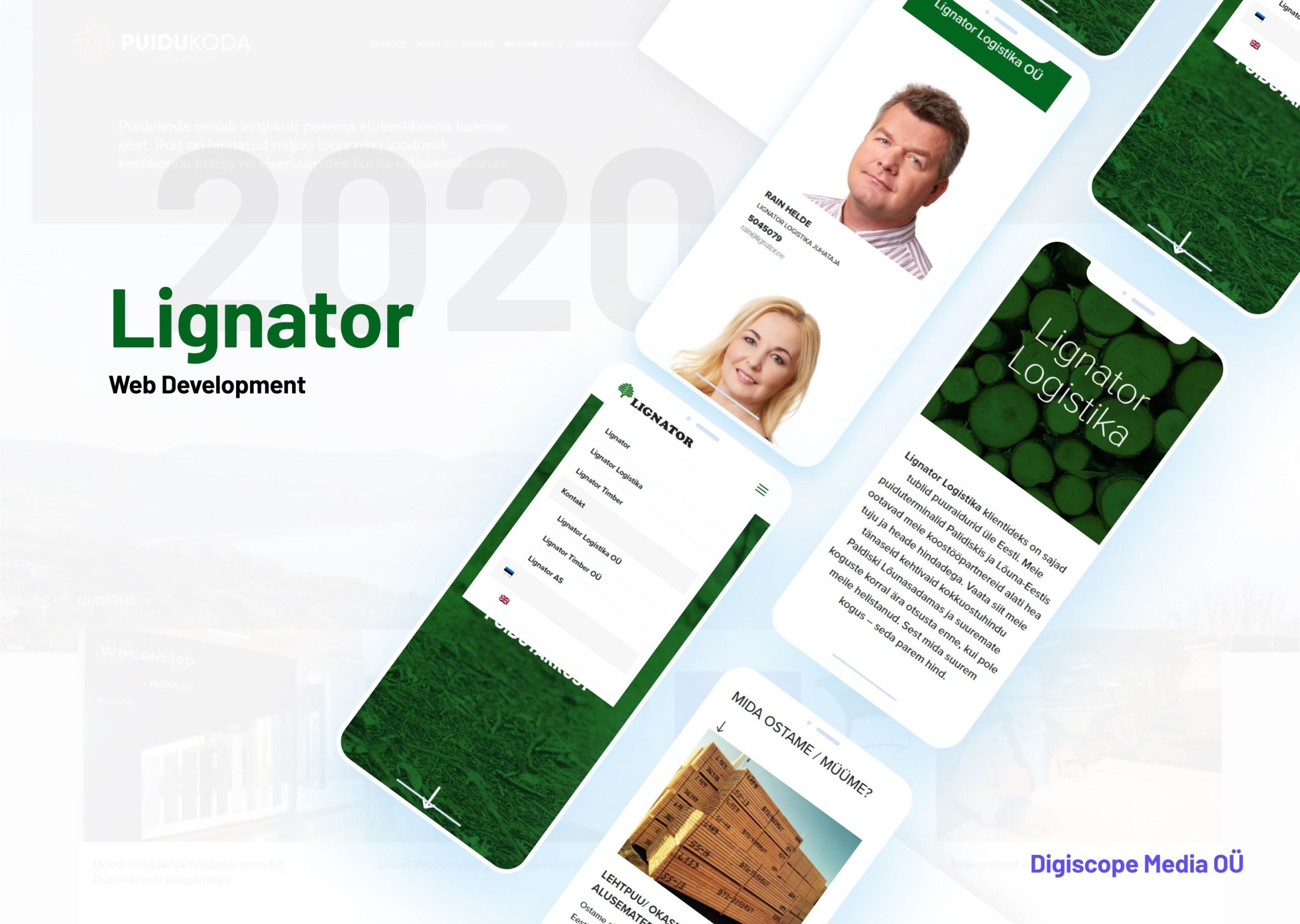
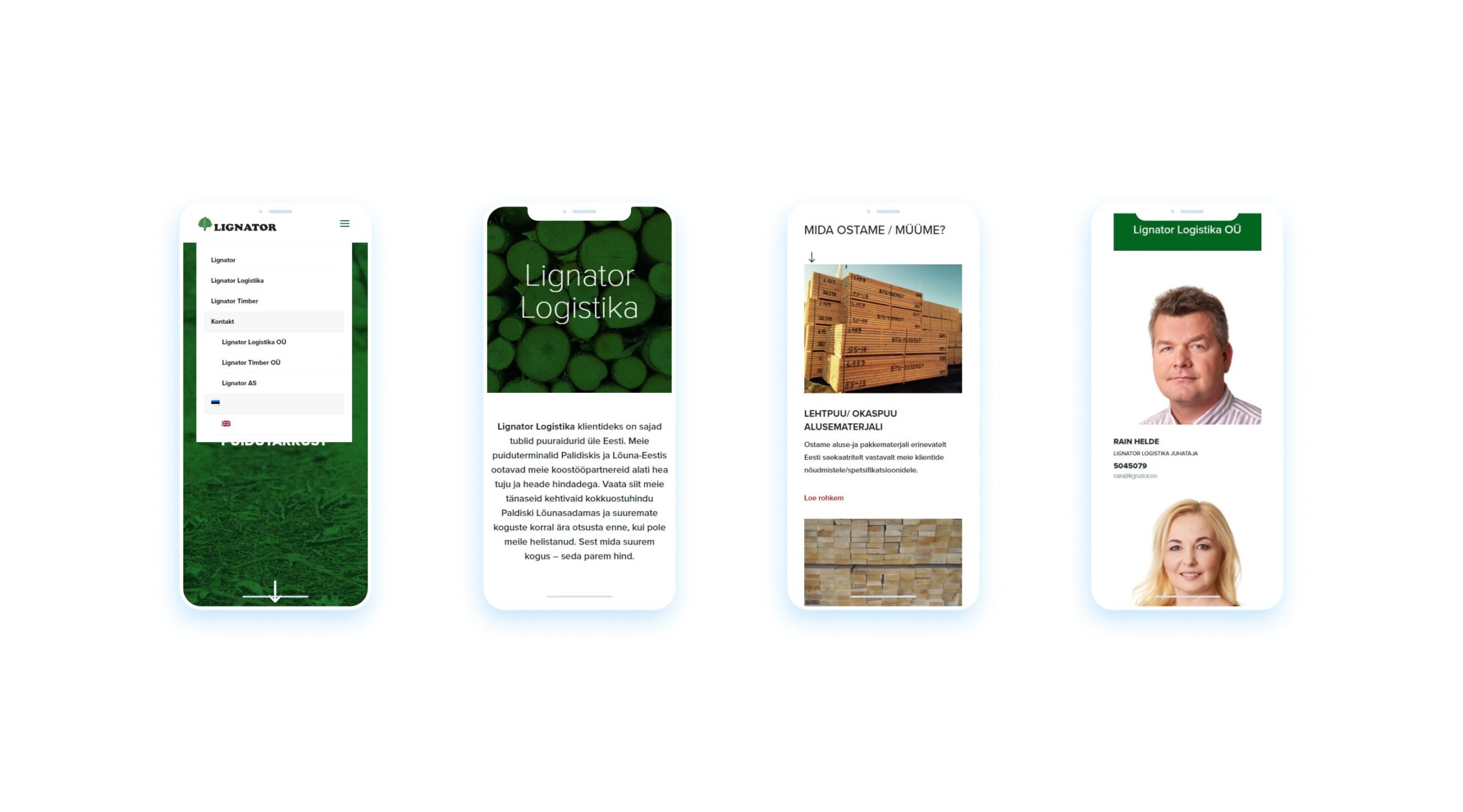
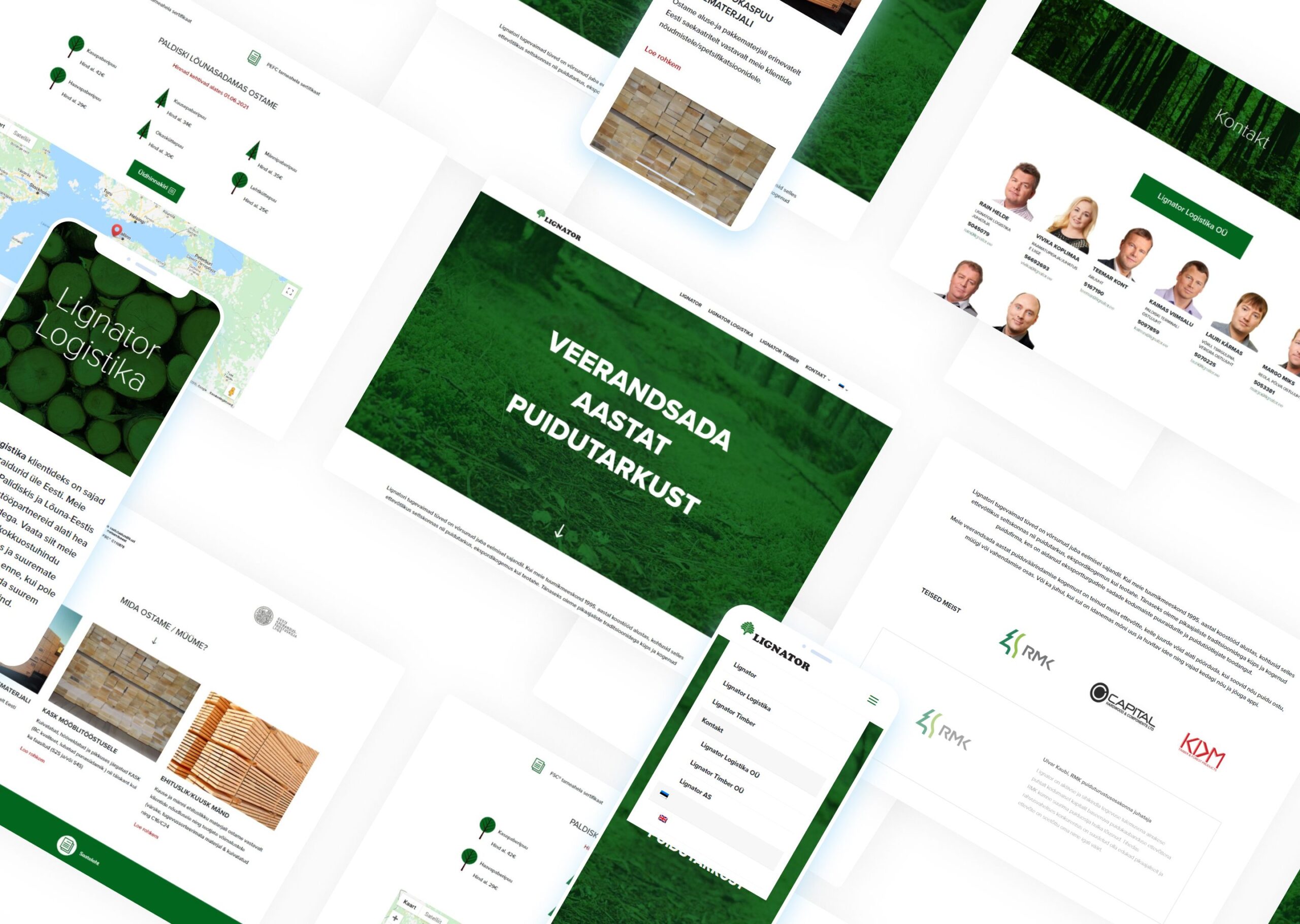
Project was inspired by nature of the business. We used green colours to emphasize the wood industry. The goal of the website was to show visitors that the company cares about sustainable business conduct and the visuals had to represent their way of work. Website is responsive, easy to use both on desktop and mobile devices. The website also includes pricing list of the current prices, which gives information to their partners and meaning to revisit the website.
Client:
Lignator
Date:
14.02.2021


Our Mission
We worked as a UX/UI designer and front-end developer. Our role in this project was to do research, branding, lo-fi & hi-fi wireframing, planning for animations and do front-end development using HTML, CSS (SCSS) and JS.
The deliverables include: Logo design and branding assets, Icons, UI design in Figma, Design language and style guides, Front-end development.
Visuals
The discovery phase is very important for any project. we started by asking a few questions about the project like target audience, styling, competitors, inspirational websites, etc. After defining a user and problem statement, we started researching and creating mood boards for the project. Since it is focused on wood workshop companies, we tried different color palates with good contrasts between fresh bright colors and muted colors.
