What is a brand book and why your brand should have it as well?
In short words: the brand book is a map that illustrates how your brand’s visual identity is built and supports on to how to use it. Brand design is much more than a logo. When building a brand, putting together visual guidelines might not be at the top of your to-do list, but there are reasons you might consider taking the time to build a strong brand book.
- It sets rules and standards.
- Helps to keep consistency and focus.
- Helps to make the brand recognizable and build brand value.
Firstly, your brand is one of your company’s most valuable assets – a brand makes your business memorable, increases value in consumers eyes, supports the marketing, advertising and makes your business more appealing to future & current employees. Every time people see a specific brand’s marketing materials, website or some other media content – they recognise a similar style, therefore the brand seems more trustworthy as it is already familiar for the person. This on its own increases sales and margins – the customer already knows what to expect and is willing to pay more.
“Branding is about delivering on a promise.”
Generally, it is rather easy for a young company to stick with a consistent design style when composing distinct brand materials, but working without regulated guidelines is not very sustainable in the long-term view. As the business grows and work pace fastens, it gets more difficult to keep the same consistency when developing brand assets. To prevent this, it is useful to create brand guidelines that everyone can refer back to understand how to represent the brand – especially if many different people create content for the brand.
You probably know every little detail about your brand, but a new employee may not. A concrete brand book also makes designers’ work easier as they don’t need to start thinking about choosing suitable colours and fonts for a simple advertisement they’re creating.
And no, your brand guidelines document does not have to be 50 pages long – you can also keep it simple and have the most important information all compound on one page.
Typically, brand guidelines consist of information such as:
Visual references:
- Allowed changes and modifications while creating communications materials
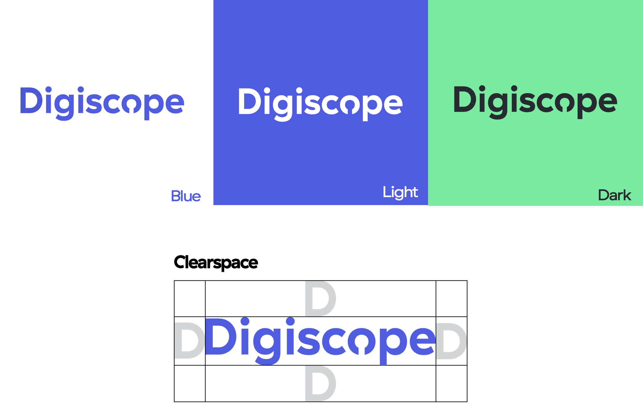
- Logo and icon – meaning, design, usage and spacing
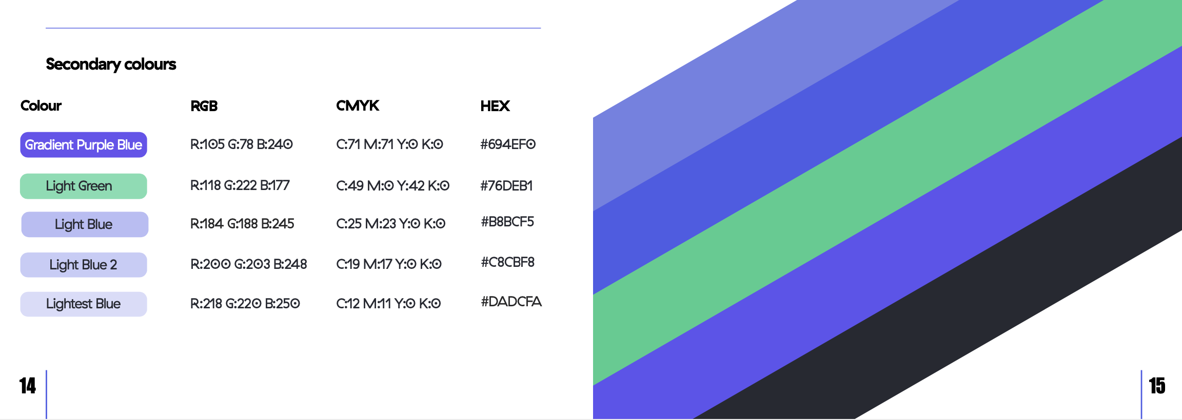
- Company’s colour palette – primary and secondary tones
- Typography and text hierarchy
- Stationery design
- Illustrations and visual design style
Additional information on brand identity – the components that create a brand’s personality:
- Its vision & mission statement
- Core values
- Tone of voice and personality
All of these elements are extremely important to support the brand’s consistency and for people to recognise it. We’ve included examples from our CVI, the Digiscope Brand Book, to give you an idea of what it might look like.
1. Colour & typography
Colour has incredible psychological power and it makes up your brand. It is easier to keep between 3-5 colours and include RGB and CMYK colour codes for both web and print.
Usually, brands have a primary and secondary font with rules for when to use each.
Fonts have personalities and they say a lot about your brand.
2. Logo & icon
Might be one of the most important parts of the guideline as it explains correct usage of the brand’s logo. Include do’s and don’ts, size restrictions, correct colours (logos usually have maximum 2 colours) and spacing rules.
Additional elements that may be included:
3. Brand tone
What does your brand sound like? Think about your audience and the intent of your text – are you trying to tell a story? Is it targeted towards casual or professional readers?
4. Imagery & Illustrations
Visuals speak for your brand! Some imagery or illustrations could be included – this helps to get a better visual understanding of the brand. This could also include pattern and texture, for example the brushed metal that Apple uses.
If you are interested in creating a CVI for your own brand do not hesitate to contact us – let’s have a chat about how to make your brand’s visuals great and memorable.